Introduction
Located in an upscale neighborhood in Kuala Lumpur, this condo unit had great potential but was overshadowed by dated design that no longer met the needs of a modern living. Despite its modest size, poor space utilization made the unit appear cramped and impractical. Design trend that was once hailed trendy of its time had since become a jumble of mismatched styles, with elements that no longer complemented each other or served the functionality needed for today’s lifestyle.
For this project, I had the opportunity to work with a wonderful couple who had a clear goal in mind—to completely revamp the space. They envisioned a modern, simple, yet functional space that would truly reflect their needs and lifestyle. I was also tasked with overseeing the entire project, from concept to completion, bringing their vision to life.
However, as with any renovation of an older unit, this project came with its own set of challenges. Given that the unit was over 20 years old, there were strict building codes and regulations that we had to comply with. This meant working within these constraints while still delivering the functionality and aesthetics the couple desired. Through careful planning and creative problem solving, we were able to transform the space that blends contemporary style with practicality. The final result is a space that not only meets the couple’s current needs but also stands the test of time.
“The way we live and work is constantly evolving, and our interior spaces should evolve with us.”
— Zaha Hadid
Pre-reno : Identifying challenges
One of the biggest challenges we faced was the low ceiling height, which made the space feel even smaller and more cramped. With limited vertical space, we had to find a way to conceal electrical and plumbing while keeping the ceiling lowering to a minimum.
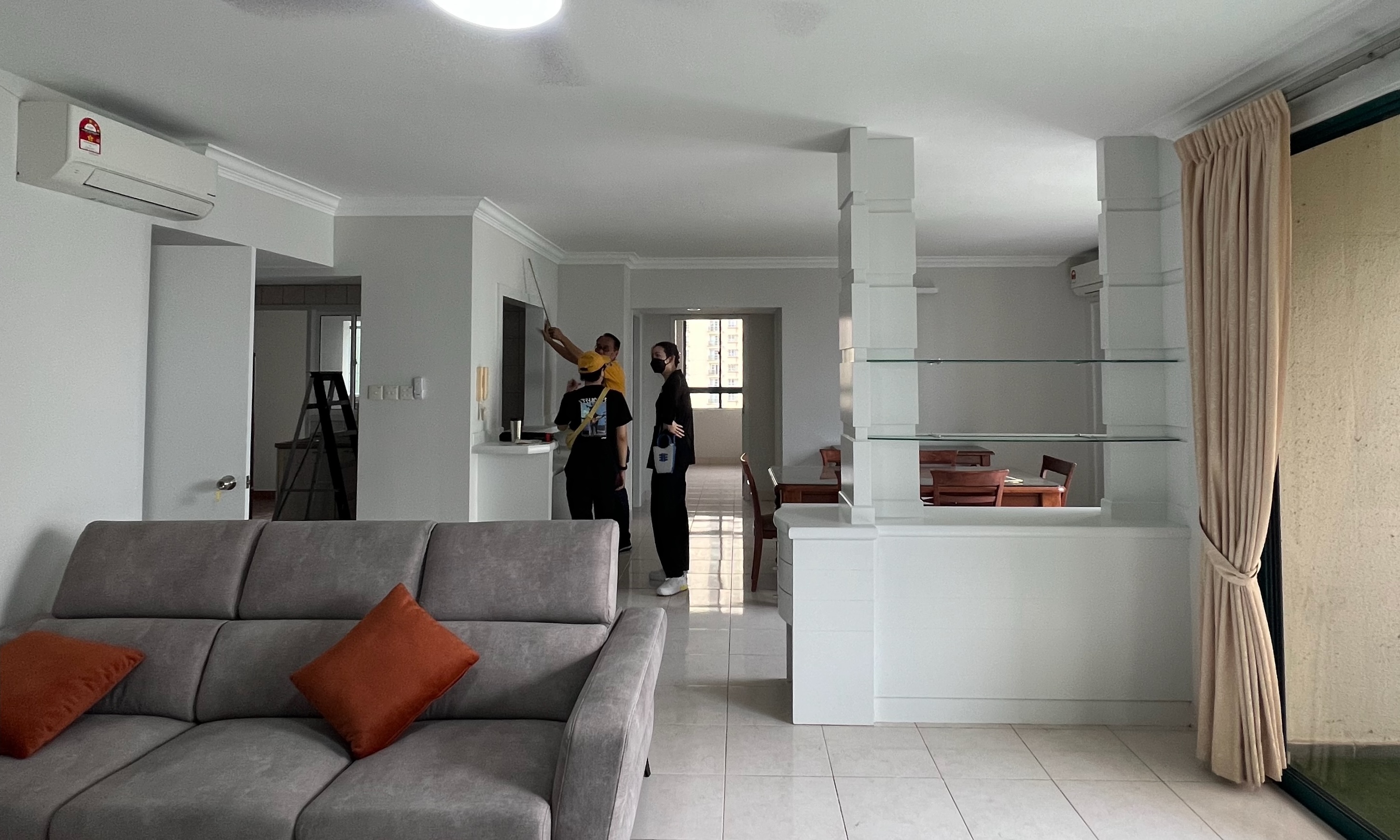
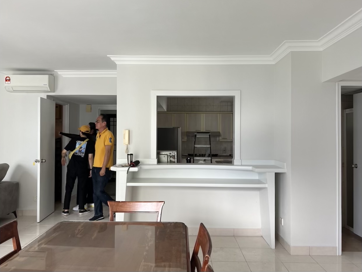
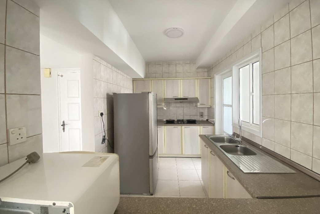
Another challenge we faced was the small, inefficient kitchen layout. The space was limited, and the client wanted plenty of storage. As designers, it was our job to find creative solutions to maximize functionality without sacrificing style.
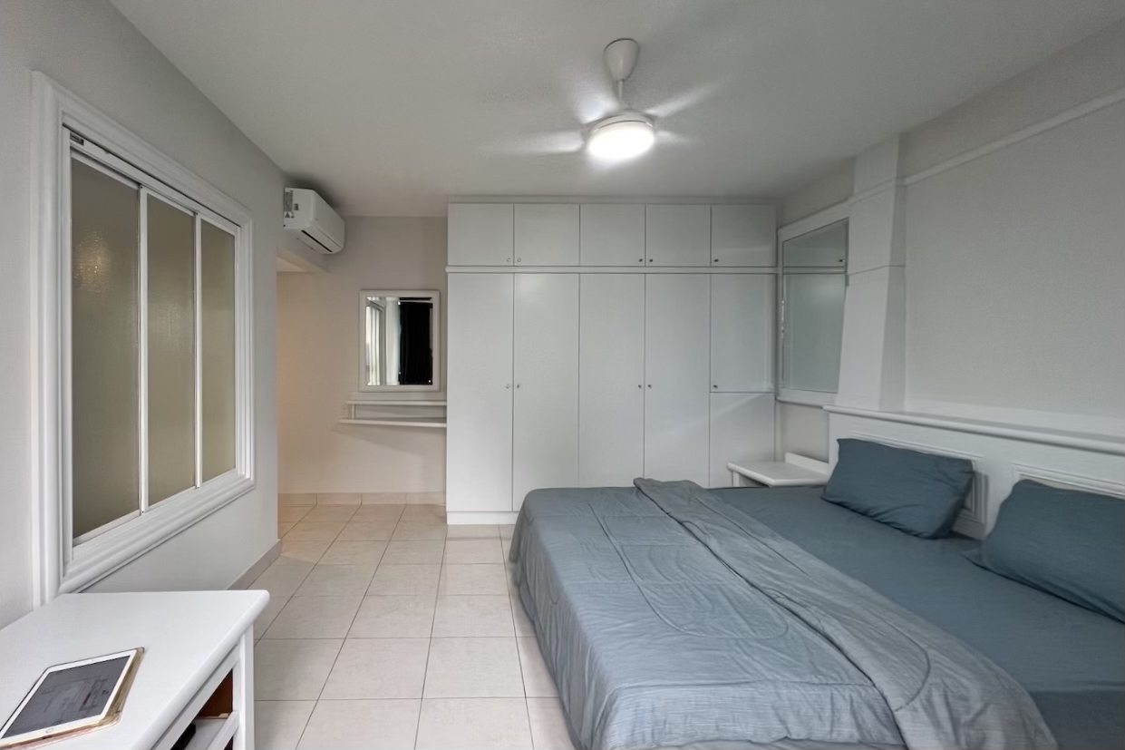
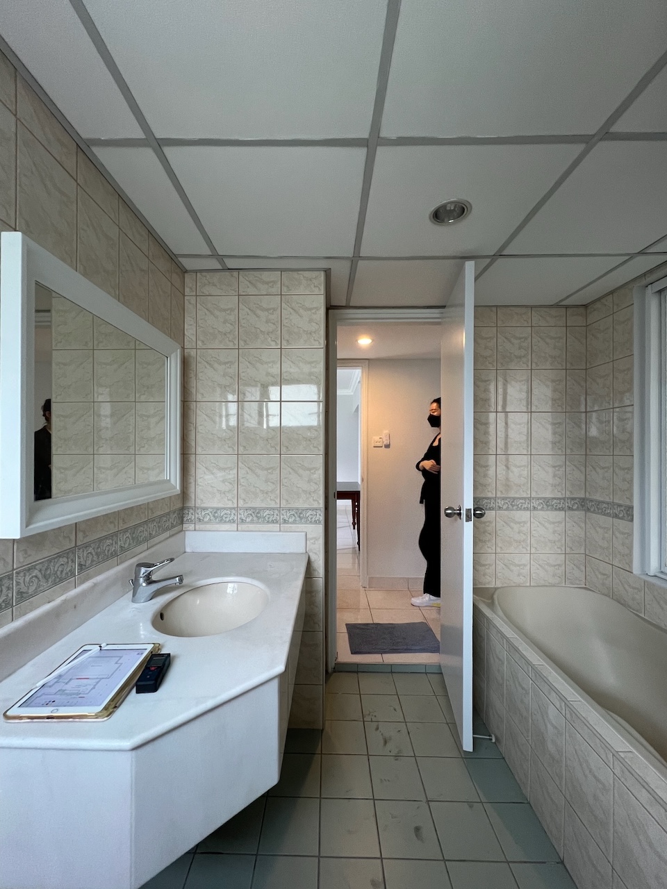
Meanwhile, the bedroom featured a screen that opened directly into the bathroom, which was far from ideal. The bathroom also needed much attention, as its outdated fixtures contributed to the overall dated and disconnected feel of the space.
Design phase: Crafting the perfect design
The client wanted a space that is modern, simple yet functional. With this in mind, our aim was to design a layout that would maximize the existing space. We opted for a natural, light color palette to enhance the brightness of the space, making it appear more spacious and inviting. Since client wanted the space to look clean and neat, storage solutions were carefully planned to ensure functionality without clutter.
3D renderings were also created to help the client visualize the space and gain a clear understanding of how it would look once completed. Ultimately, the goal was to create a versatile living space that would remain practical and stylish for years to come!
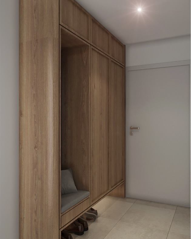
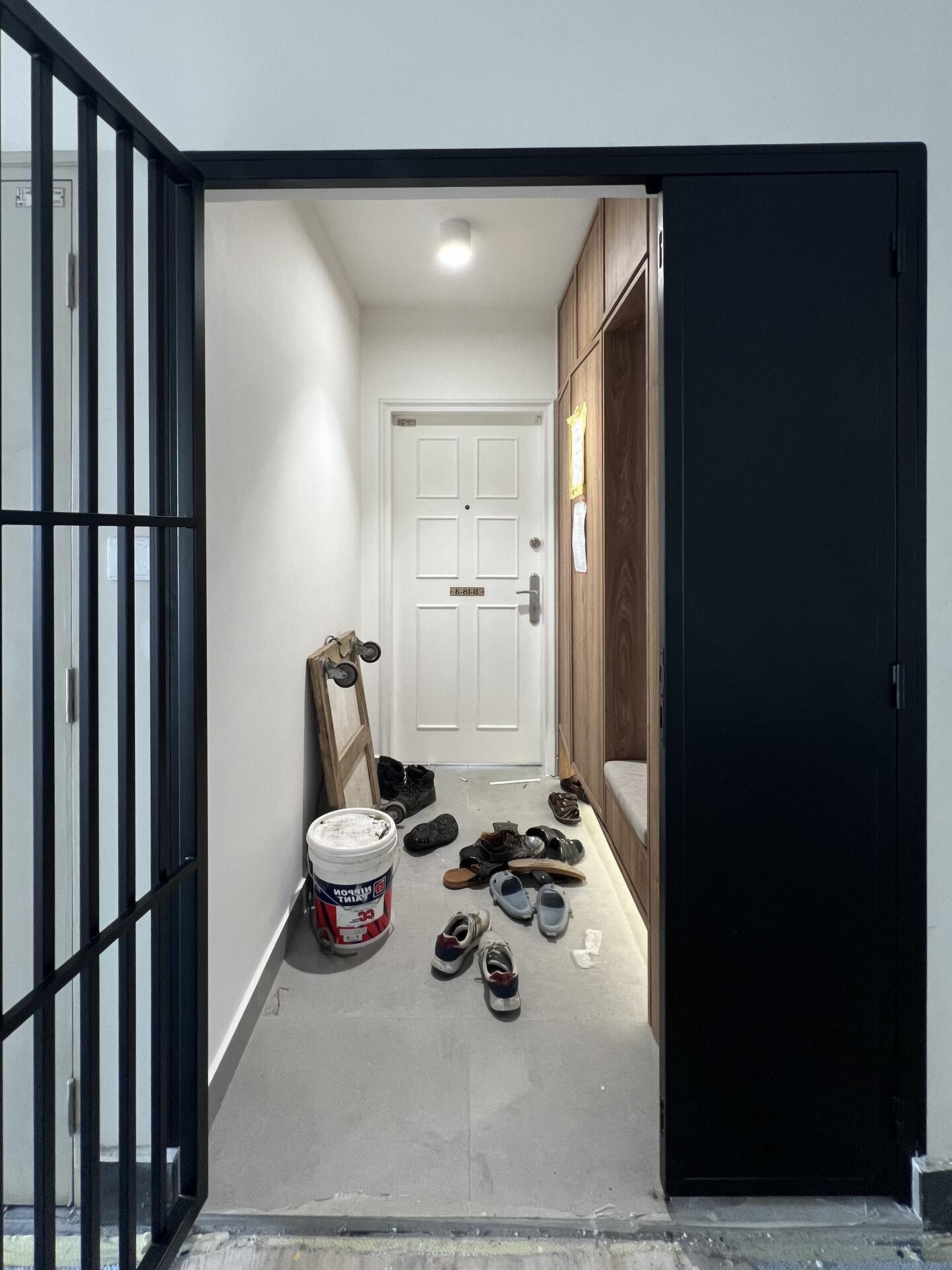
The shoe cabinet at the entrance is the only built-in piece with a darker finish, creating a bold contrast with the rest of the space. It also has a small seating area for convenience and an open bottom section for easy access to daily wear shoes.
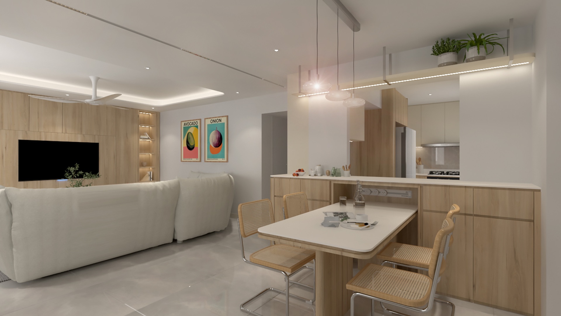
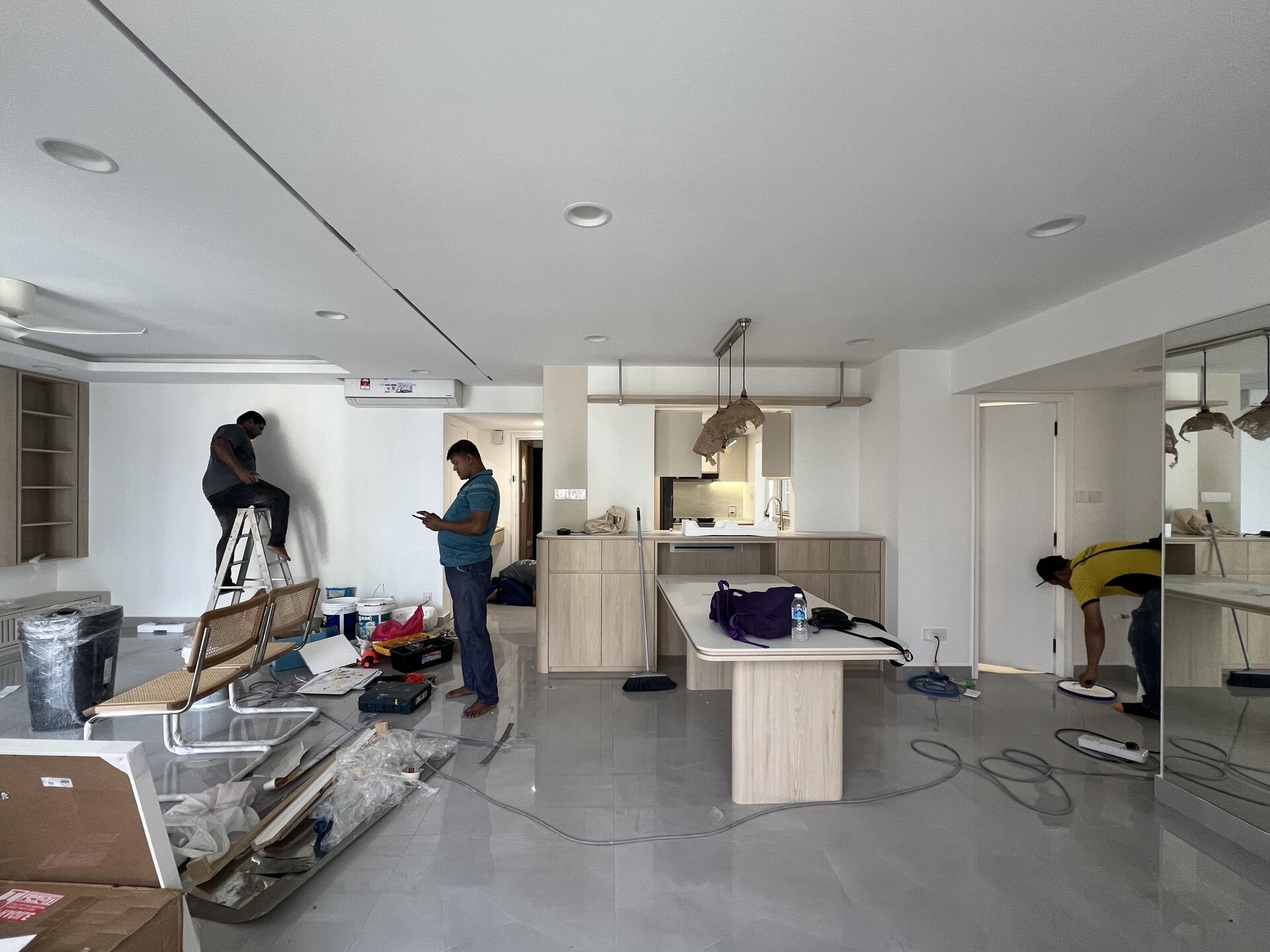
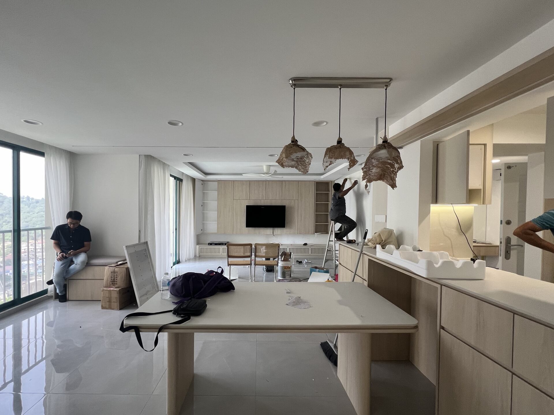
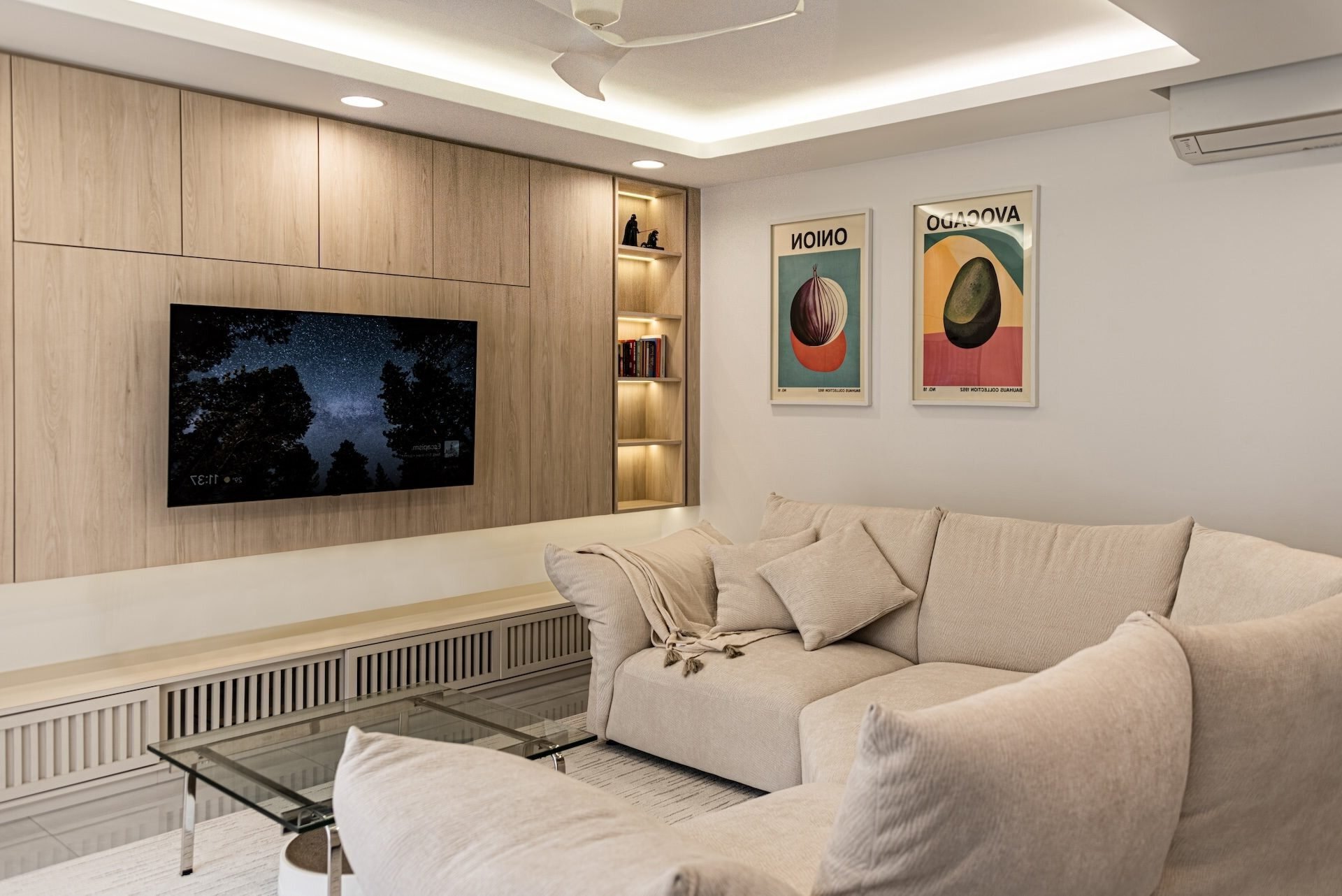
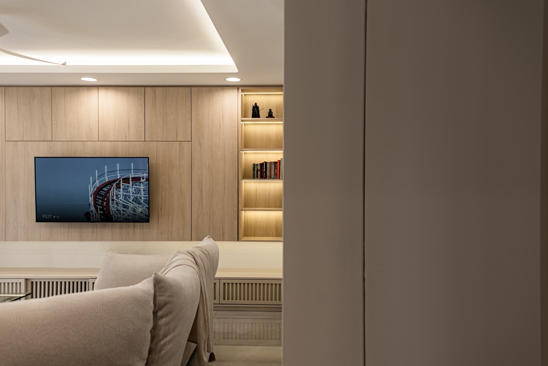
The living and dining area uses the same finish to create a unified look and prevent the space from feeling too busy. The dining table is also extendable, perfect for hosting extra guests, and it also doubles as a workspace too! To further keep things sleek and practical, a hidden power track is integrated into the cabinet. This way, outlets are easily accessible without interrupting the clean, minimalist look.
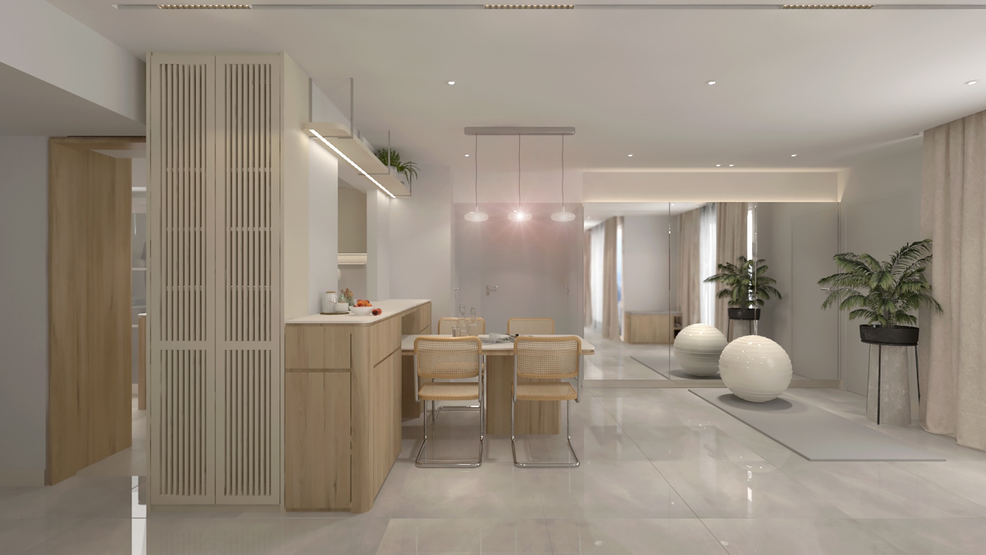
A mirror has also been added to the living area to create the illusion of a larger space. It serves a practical purpose as well, providing a space for the client to do yoga and light workouts.
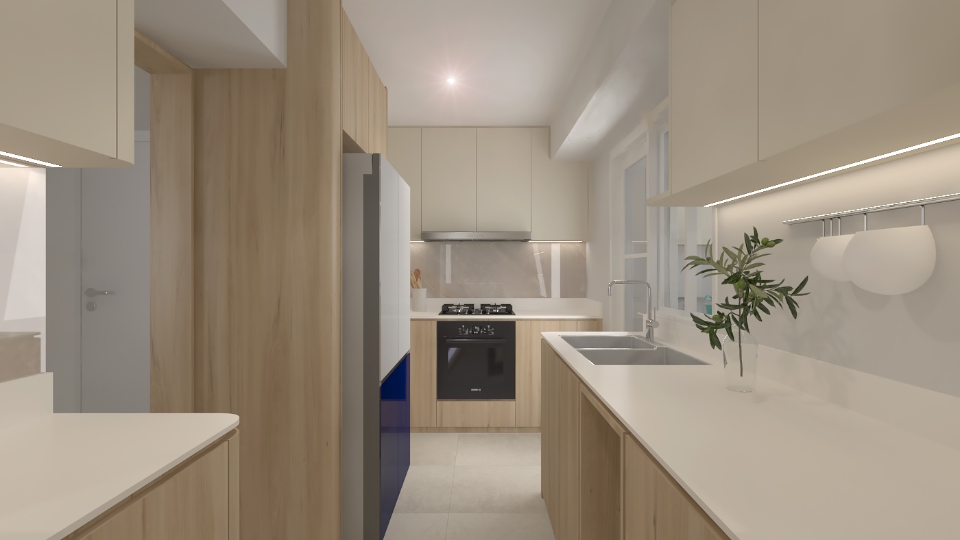
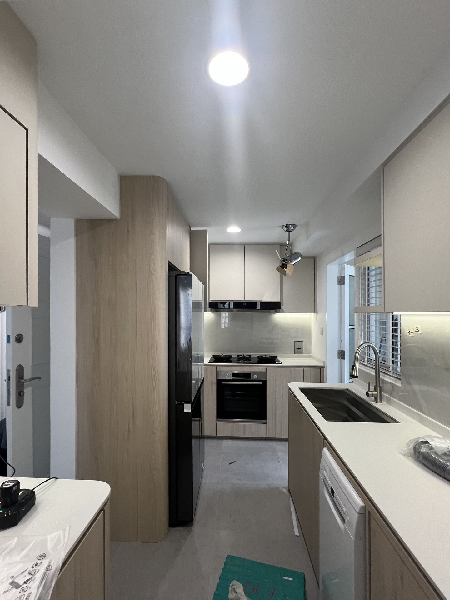
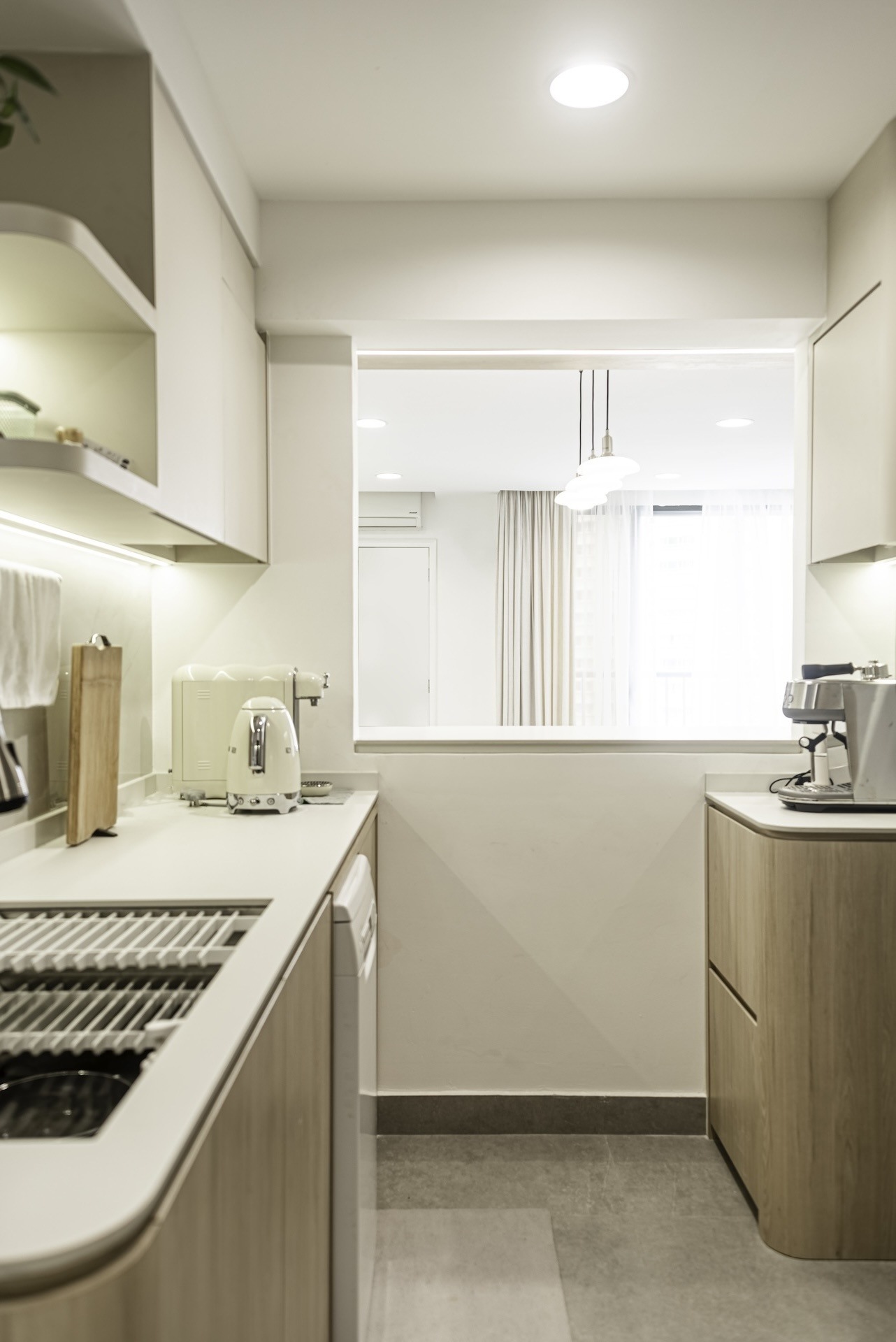
The same materials that was used in the living and dining areas extend into the dry kitchen, creating a seamless flow between the two spaces. Storage was also a key priority for the client, so every available space has been maximized to ensure plenty of practical storage.
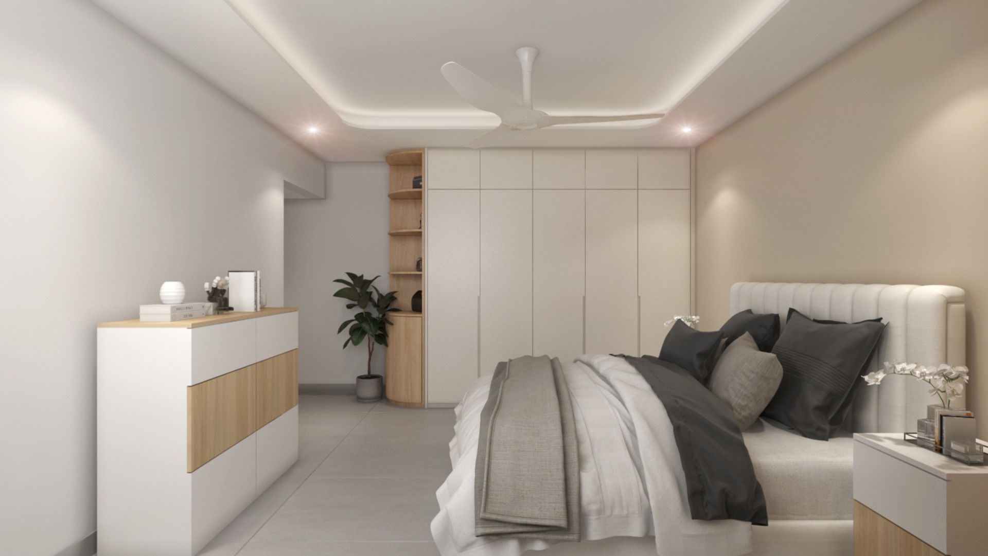
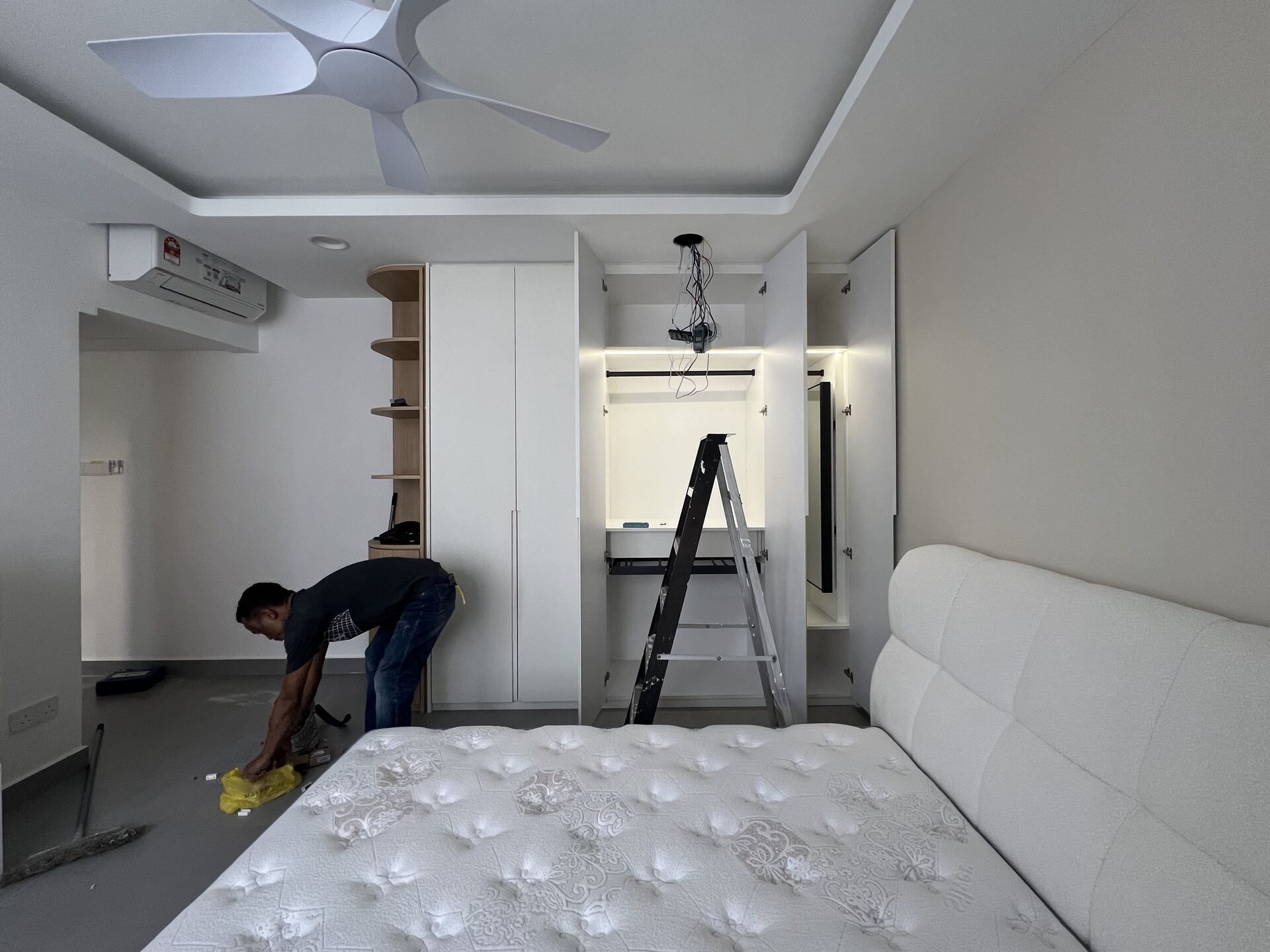
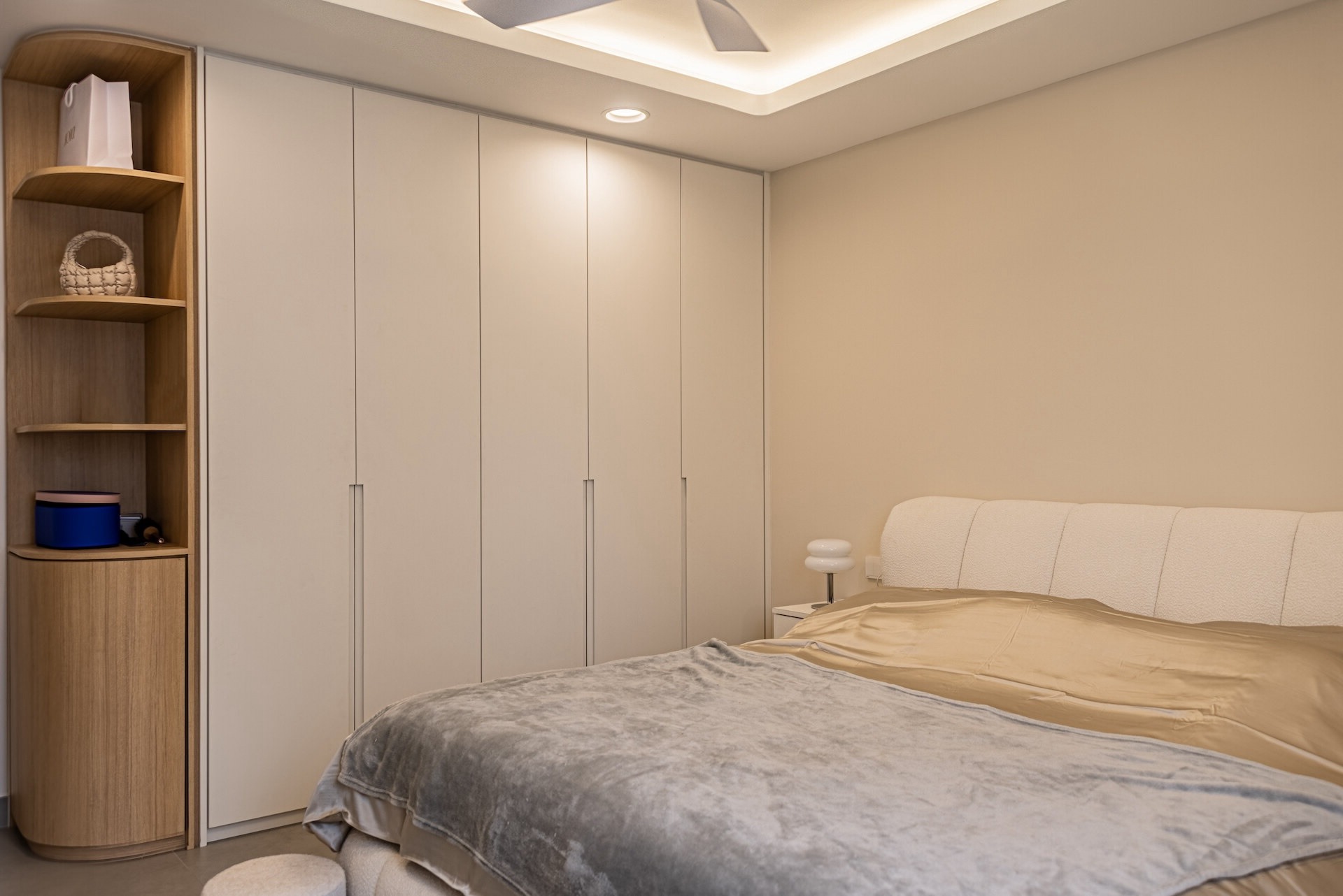
The master bedroom is designed to be cozy and inviting with a wardrobe featuring a curved design that softens up the space.
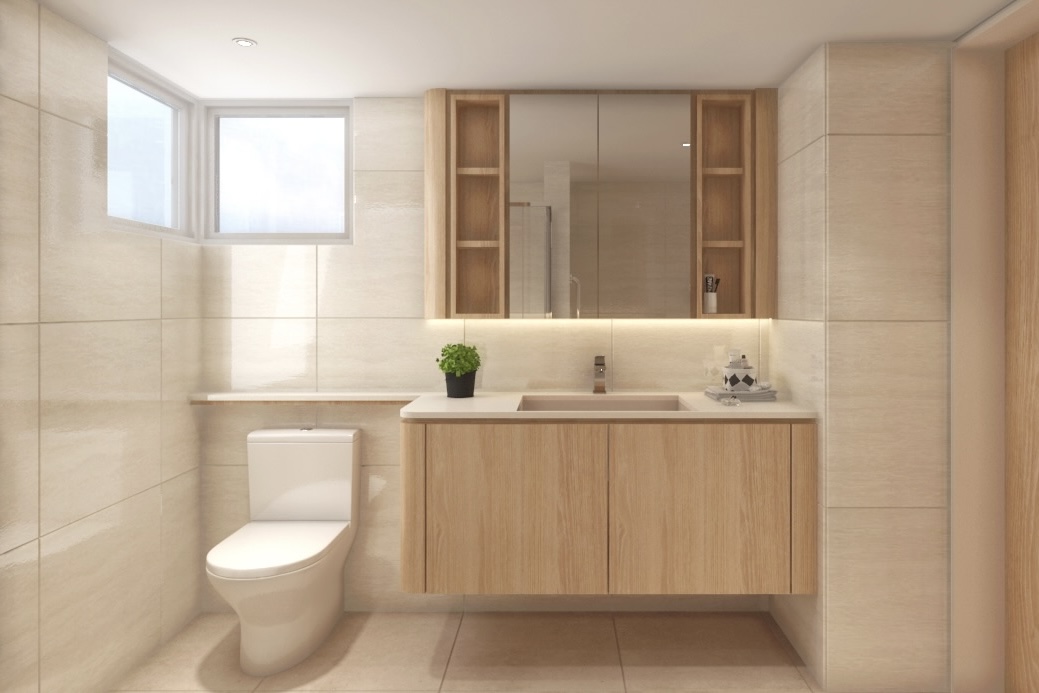
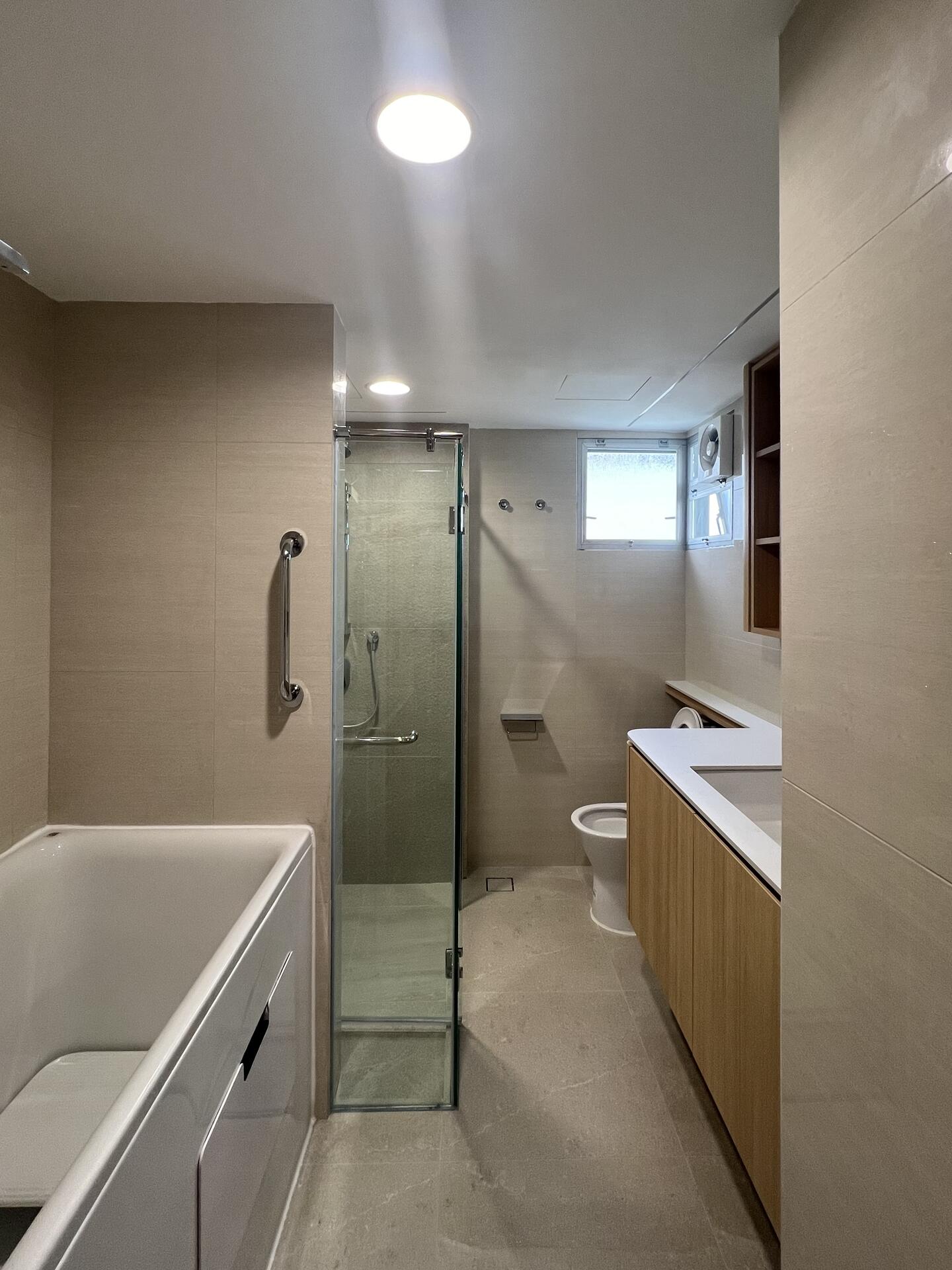
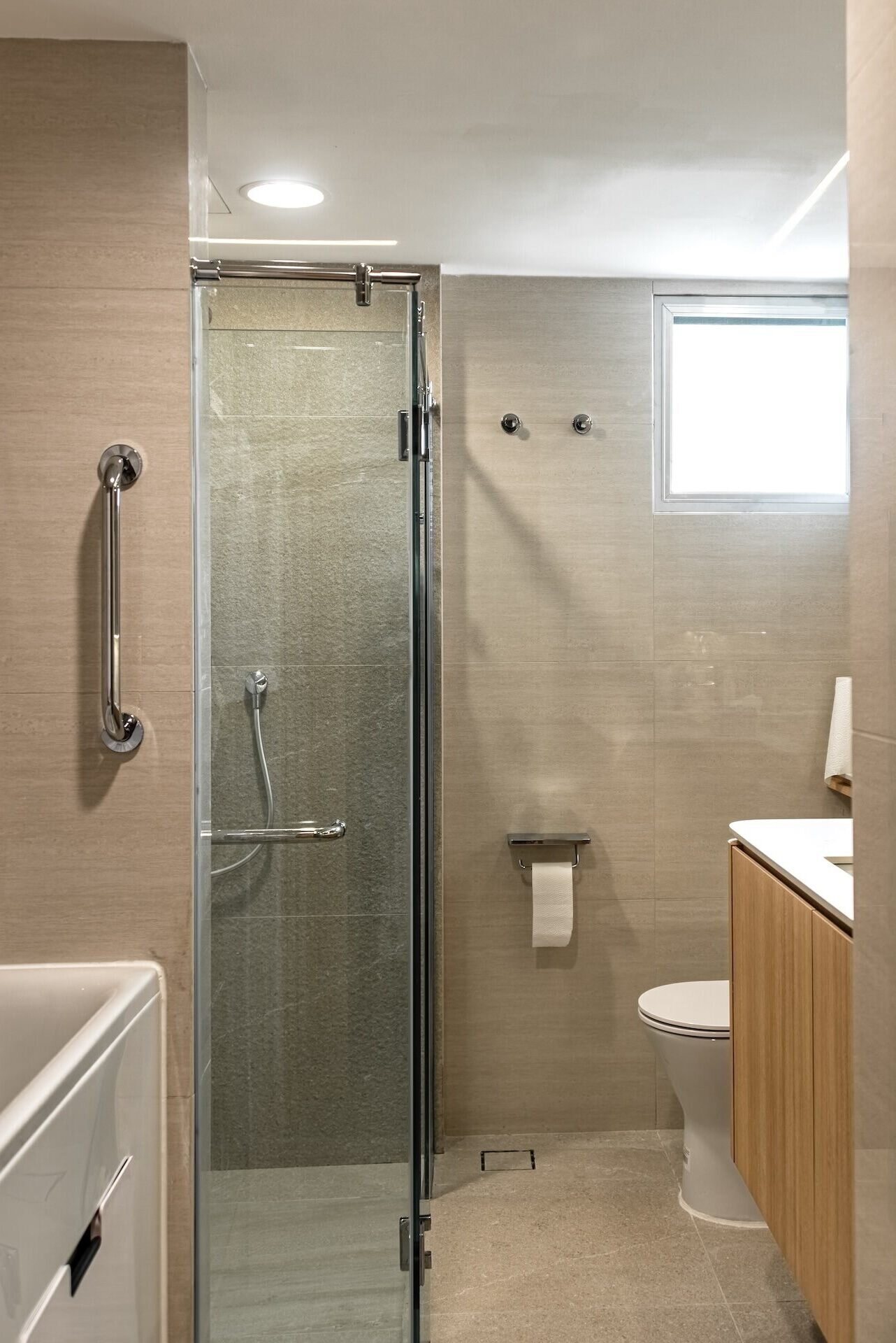
As for the bathroom, the client wanted a space that feels comfortable and bright. We used light-colored, glossy wall tiles to reflect light and make the room feel more spacious. The simple, clean design ensures the bathroom is both functional and inviting.
The transformation: Step-by-step highlights
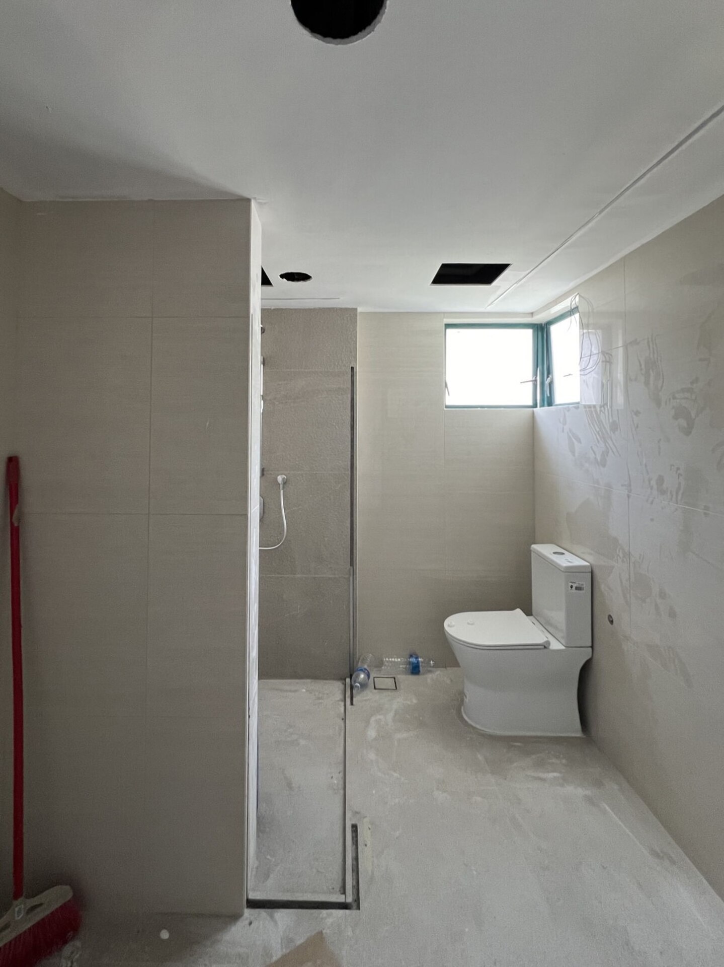
We kicked off the renovation by stripping away outdated elements—old tiles, worn-out fixtures, and everything that no longer worked for the space. We then tackled the more technical stuff which includes updating the plumbing and electrical systems to meet modern standards. Ceiling were also replaced and walls were skimmed to get a smooth, clean finish. We also carried out a ponding test during the waterproofing process to ensure there would be no water leakage down the line.
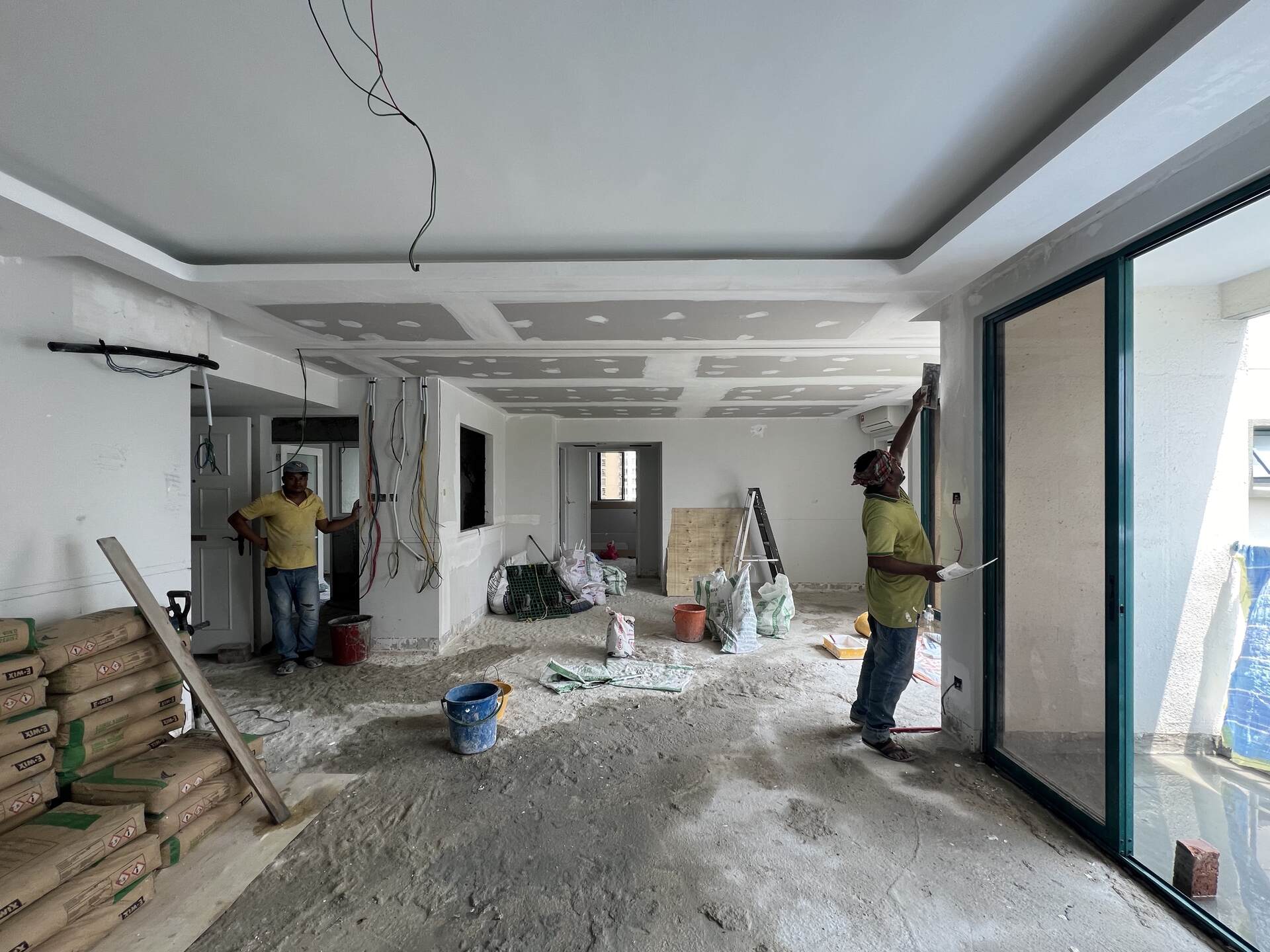
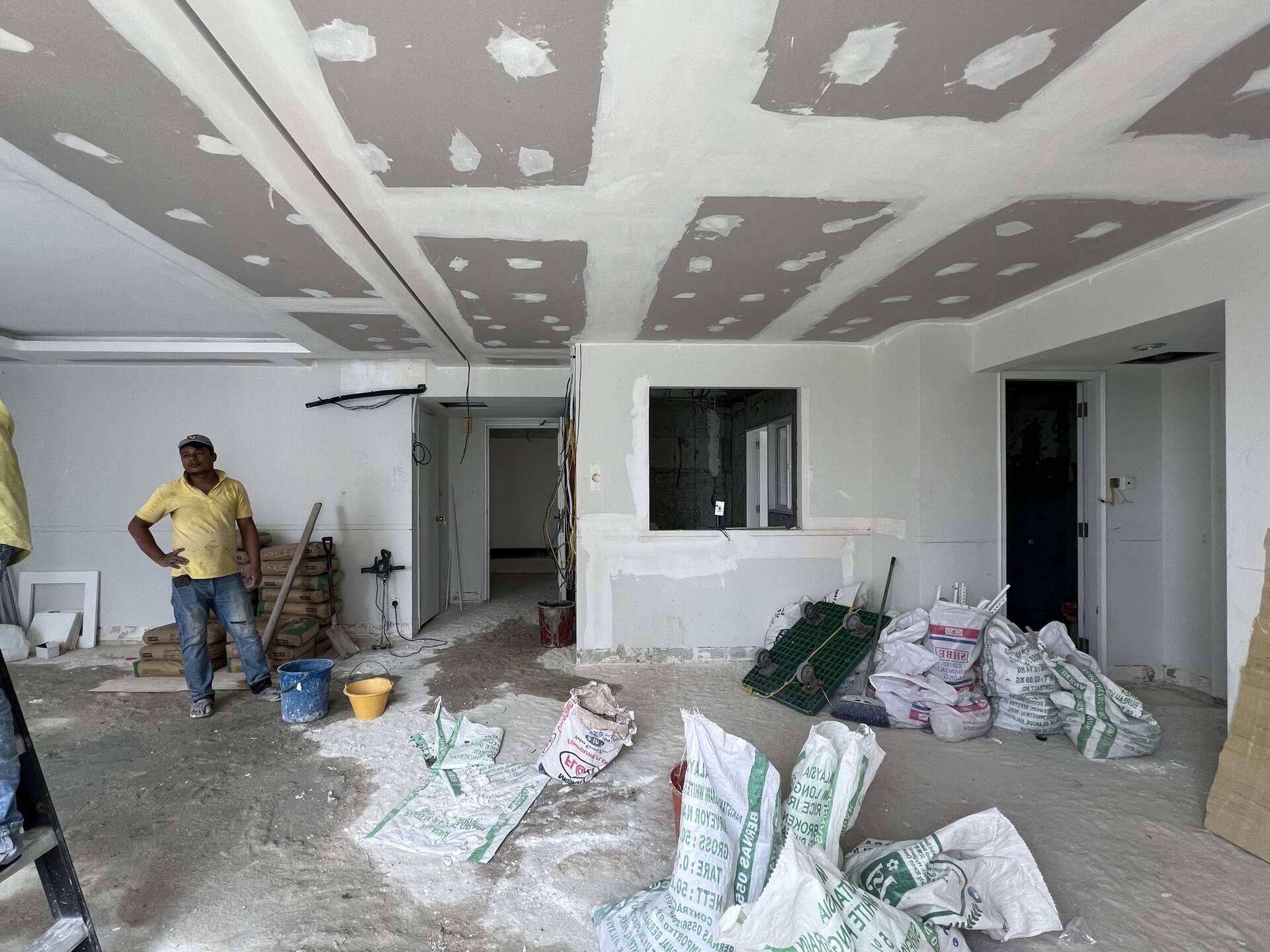
Originally, we planned to remove the wall separating the kitchen and dining area to open up the space. However, during the renovation, we discovered that the wall was a shear wall. It was crucial to the building’s structure and couldn’t be removed. So, we had to quickly come up with a new design that worked with the existing layout.
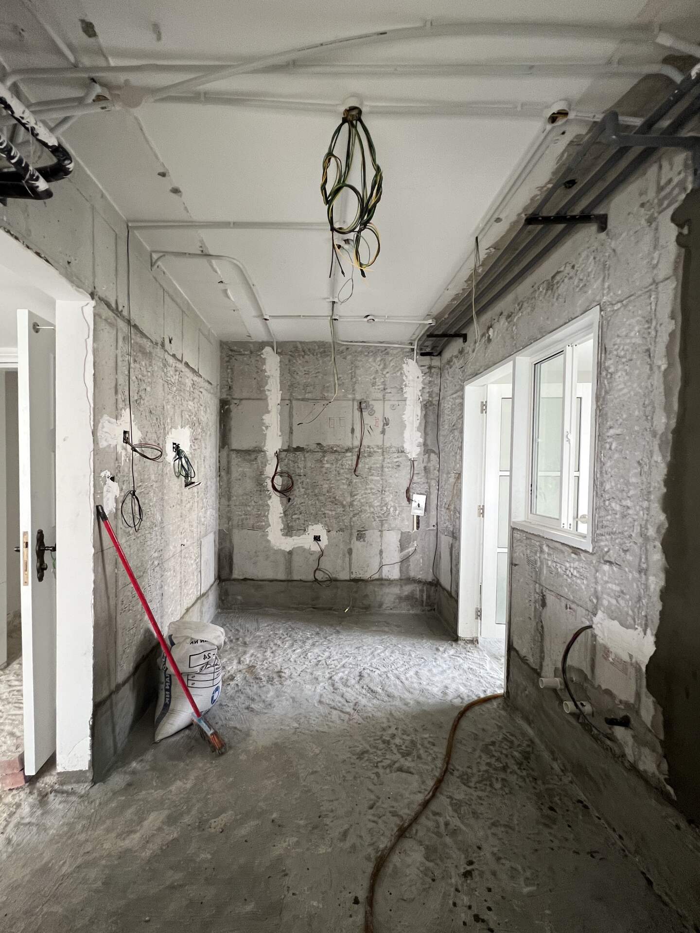
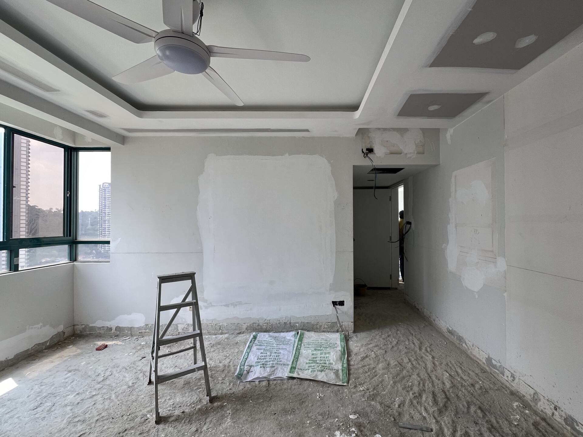
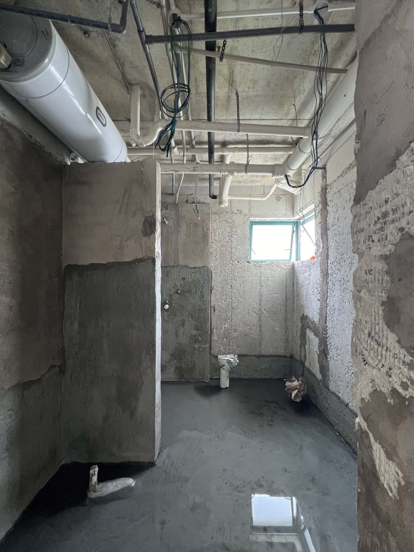
Next, we installed tiles that fit the new design and gave the walls a fresh coat of paint. We also swapped out the old bath fittings for something more modern.
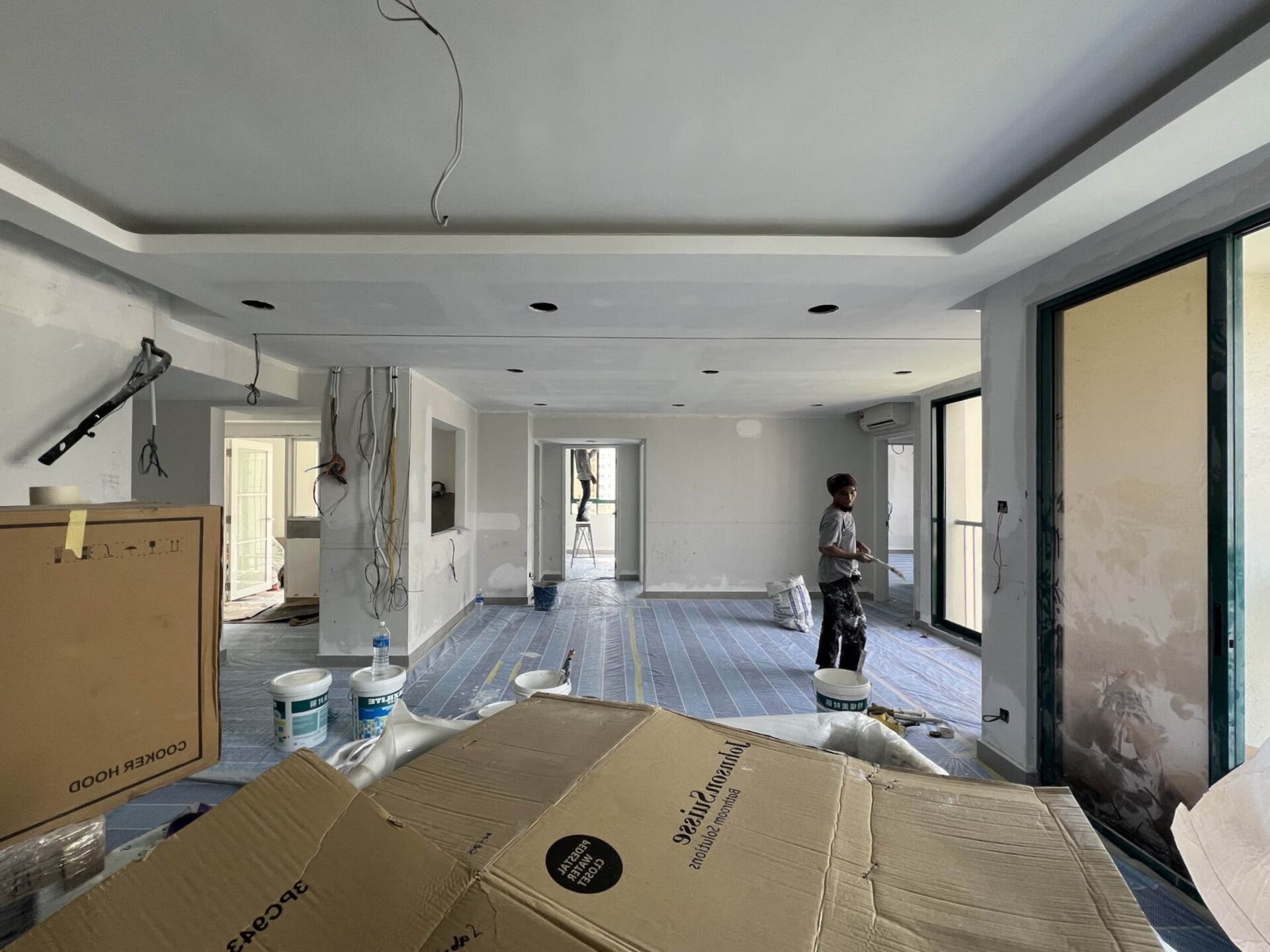
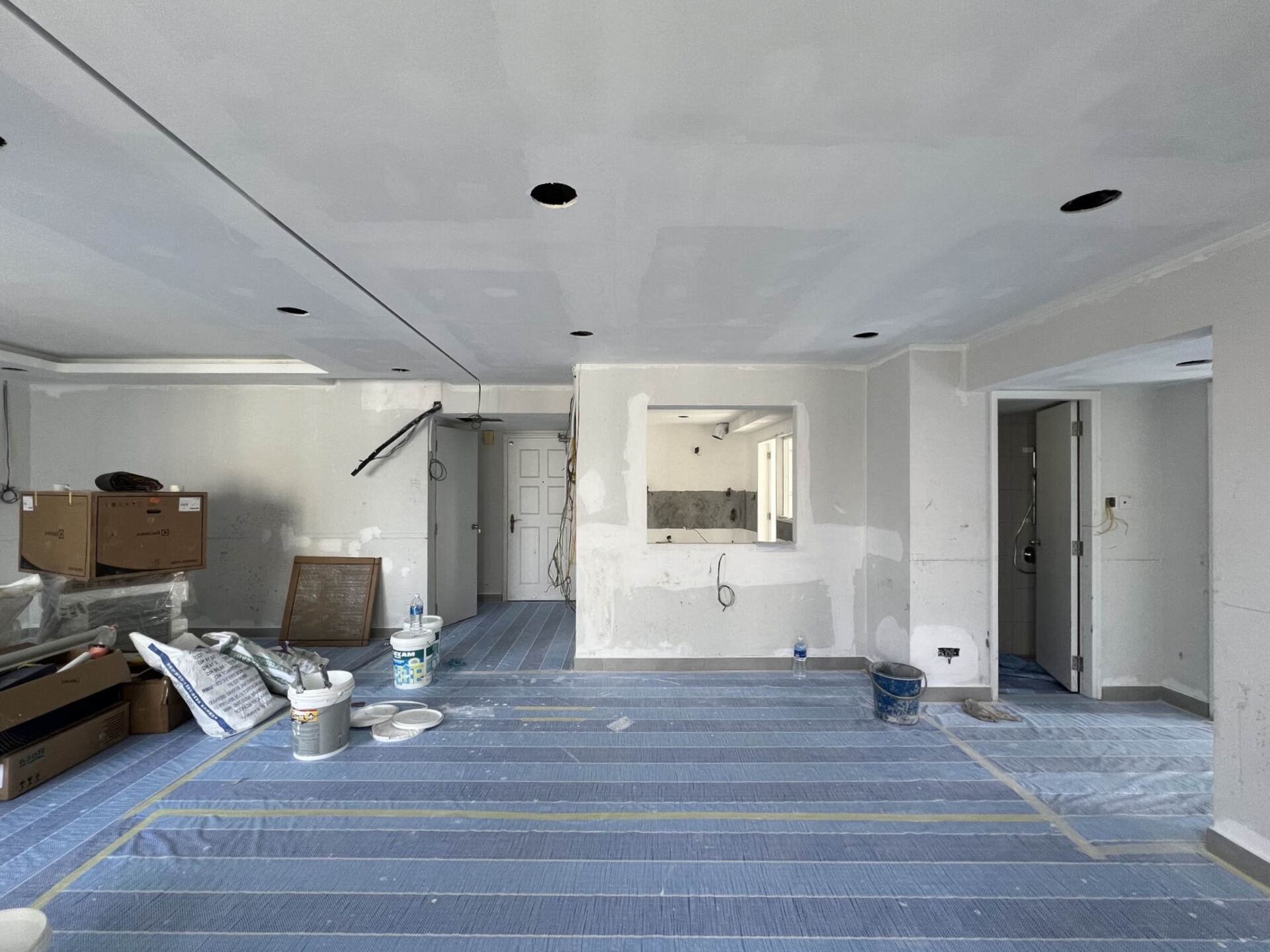
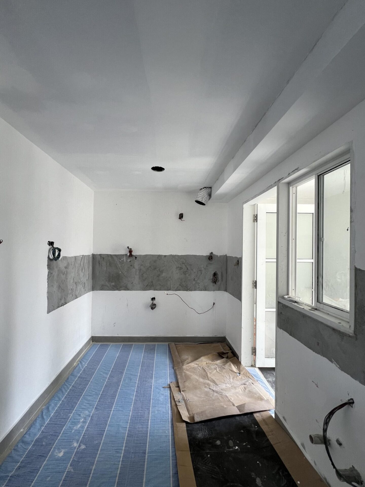
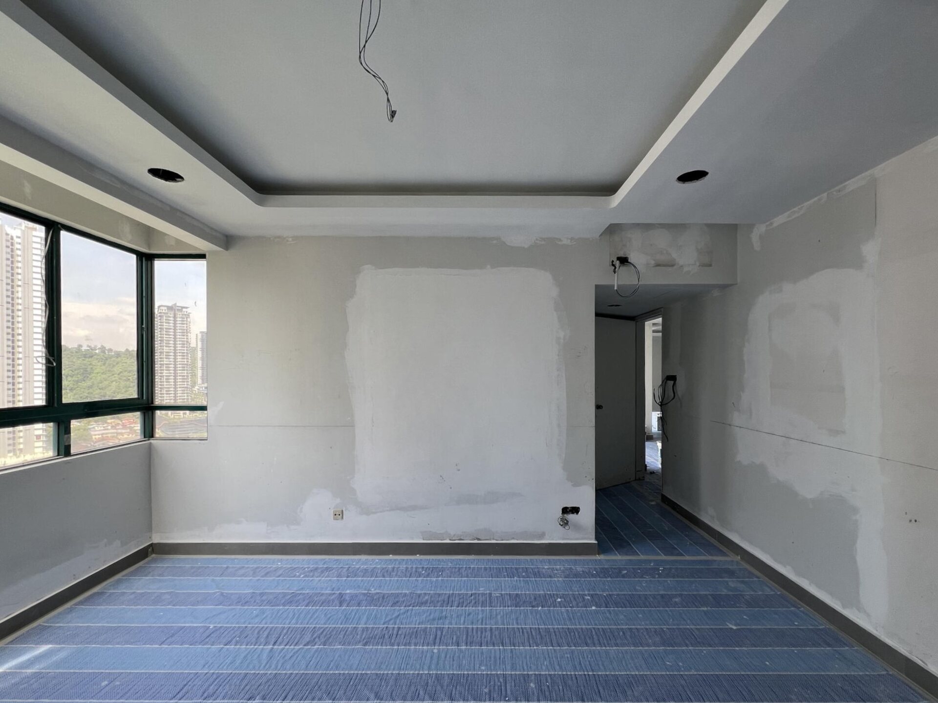
The carpenters were the final piece of the puzzle. They came in to install the custom furniture we’d had pre-fabricated off-site. Once that was in place, it was time to bring in the loose furniture and accessories to really tie the whole space together. After a quick final touch-up the unit is set for handover to the client!
The reveal: From Drab to Fab
After about four months of hard work, the space is finally ready for move-in. It’s hard to believe this is the same condo from before! The space now feels so much brighter, more open, and just… better. Gone are the days of cramped corners and mismatched furniture!
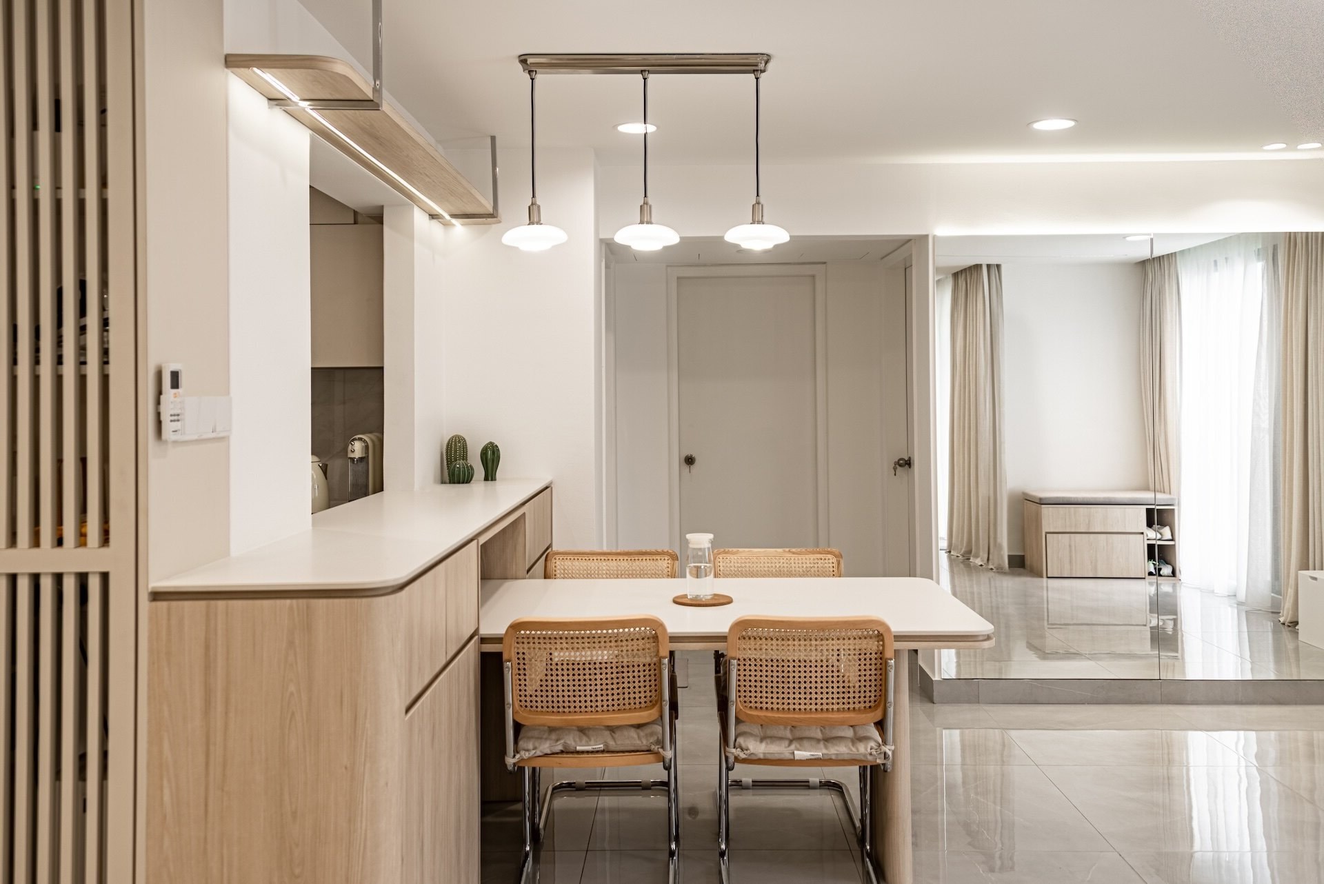
The living room now offers ample storage, with all wiring and electronic devices neatly tucked away, maintaining the clean, streamlined look.
The kitchen which used to feel cramped and awkward has been redesigned to make moving around easier—without compromising on storage.
The bedroom was redesigned to maximize storage space, with smart solutions built in throughout. We also incorporated a curved display shelf to showcase frequently used items, adding both functionality and style.
And the bathroom? That was the area that underwent the most changes. It’s now more modern and practical, fitting perfectly with the overall refreshed look of the space.
From outdated and inefficient to sleek and functional, this transformation proves just how much of a difference thoughtful design can make. It’s no longer just a condo—it’s now a place where the homeowners can truly call home.
Key takeaways
Be ready to adapt
One thing this project reinforced was how important flexibility is. Things don’t always go as planned, and being able to adapt and come up with creative solutions when challenges arise is crucial for a successful renovation.
Make every inch count
Space can be tricky, especially when it’s limited. That’s why it’s so important to make every inch count. Simple things like built-in shelves and multi-purpose furniture can really change the game. With a little creativity, even small spaces can feel open and spacious.
Make every inch count
Good design goes beyond looks—it needs to work for the people who live there. Every detail served a purpose, from optimizing layouts to adding hidden storage and multi-functional pieces. The goal was to create a home that made everyday life easier, more efficient, and tailored to the clients’ needs.
Make every inch count
Small details can make a huge difference. Curved edges on built-ins and a soft curve in the ceiling cut-out help create a smooth, finished look. Custom hardware and well-placed lighting also add a touch of personality and bring everything together. These thoughtful design choices don’t just look good, they create a space that feels complete!
The power of details
Pre-planning is essential to ensure everything runs smoothly. Setting clear timelines, budgets, and expectations from the start helps keep the project on track. Constant communication with the team and careful coordination helps ensure that design and execution go hand in hand. When the project is managed well from start to finish, it keeps everything on track and helps avoid surprises. After all, a well-managed project is just as important as a well-designed space.
“Plans are nothing; planning is everything”
— Dwight D. Eisenhower
Wrap-up
This project shows how thoughtful design and solid planning can completely transform a space. By focusing on practical solutions and maximizing every inch, the condo is now a home that truly suits the clients’ needs. Even with challenges along the way, the right approach can turn an outdated space into something beautiful and functional.

Leave a Reply